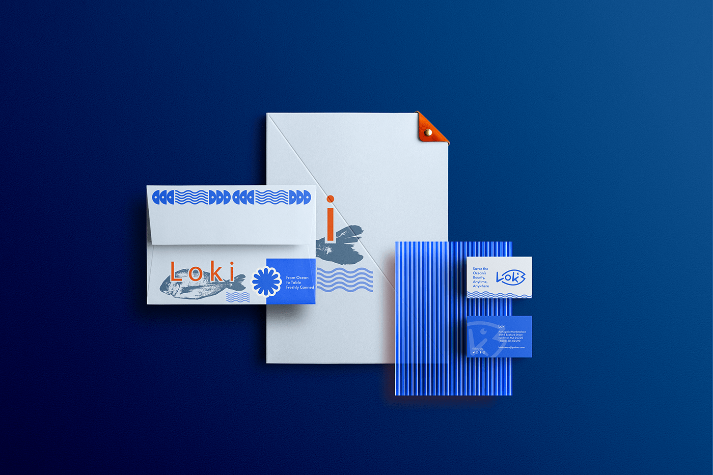
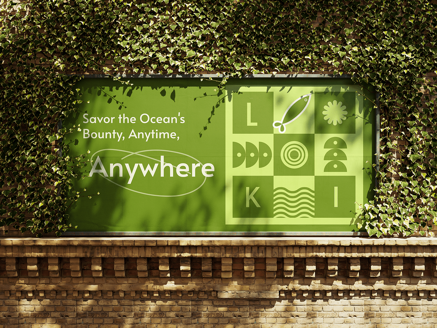
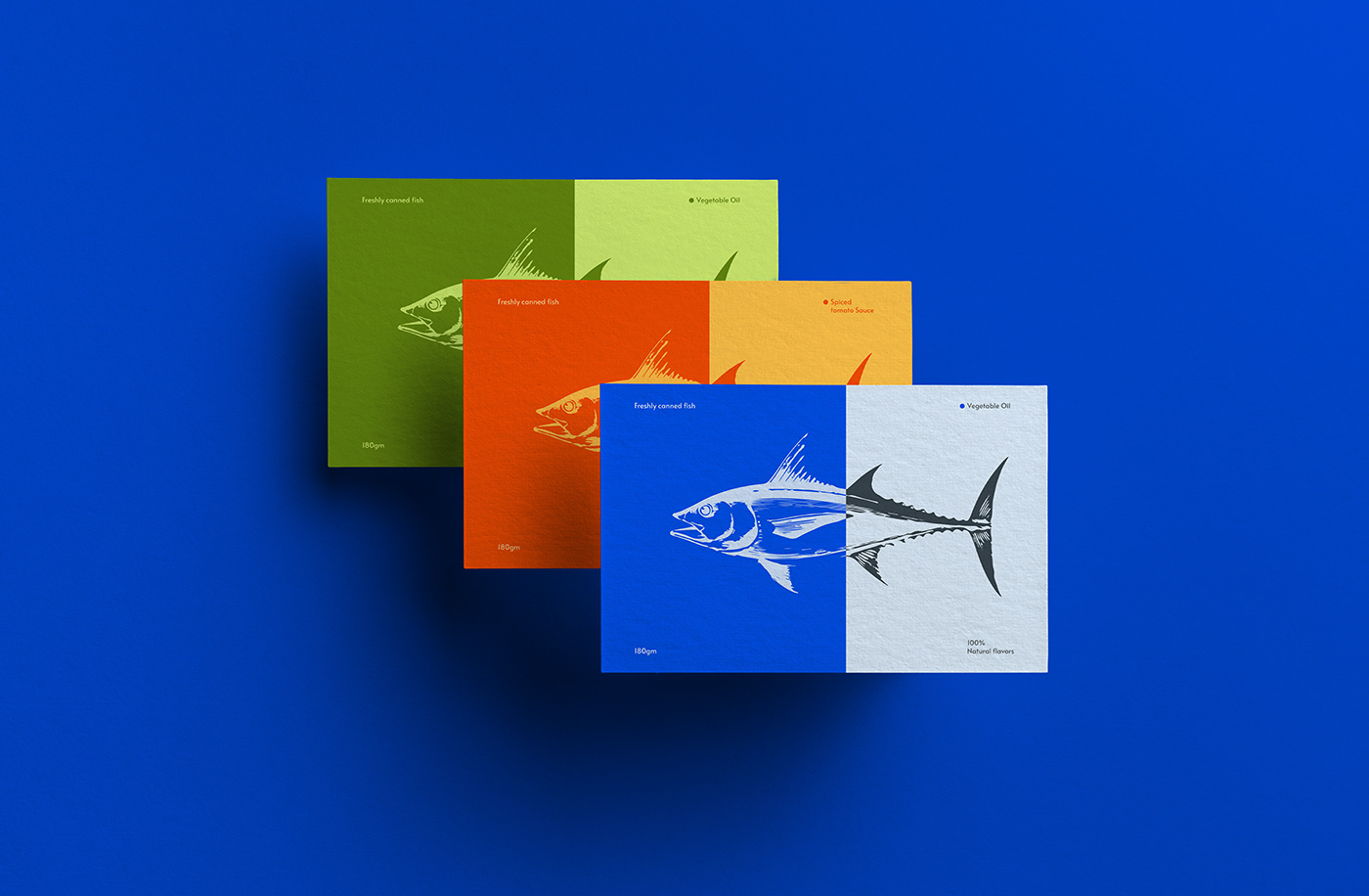
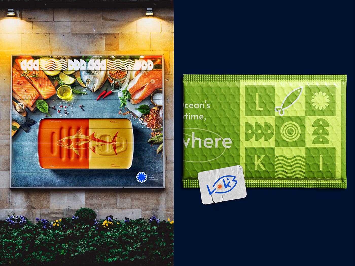
Logo / concept / Brand value / Visual design
The Loki logo features a clean and modern design, with the brand name in bold, sans-serif typeface. The letter "O" in "Loki" is creatively replaced with a stylized fish icon, showcasing the brand's connection to the ocean. This logo reinforces the brand's commitment to delivering high-quality seafood products. Loki's brand strategy is driven by a compelling vision - to elevate the seafood experience for consumers while embodying a commitment to sustainability, quality, and the pure, untamed essence of the ocean. Loki's mission is to deliver the treasures of the sea to people's tables, offering a diverse range of canned fish and seafood products that are not only delicious but also responsibly sourced and eco-friendly.
Quality: Loki's unwavering commitment to quality is reflected in every aspect of its operations, from sourcing the finest seafood to crafting superior packaging. Sustainability: Sustainability is at the core of Loki's brand identity. The brand is dedicated to responsible fishing practices and eco-friendly packaging to minimize its environmental footprint. Freshness: Loki ensures that the freshness of the ocean is preserved in every can. The brand strives to bring the pure, authentic taste of the sea to consumers. Community: Loki fosters a sense of community among seafood lovers, encouraging them to connect over their shared passion for oceanic cuisine and responsible consumption.